

The Green Grid, the data center industry group known best for creating the industry’s most popular data center efficiency metric, Power Usage Effectiveness (PUE), has developed a new metric for data center operators, called Performance Indicator.
The paper that describes it is currently available to the organization’s members only, but Data Center Knowledge received an early look. Here is what you need to know:
The Green Grid published PUE in 2007. Since then, the metric has become widely used in the data center industry. Not only is it a straightforward way to take a pulse of a data center’s electrical and mechanical infrastructure efficiency, but it is also a way to communicate how efficient or inefficient that infrastructure is to people who aren’t data center experts.
Building on PUE with Two More Dimensions
Performance Indicator builds on PUE, using a version of it, but also adds two other dimensions to infrastructure efficiency, measuring how well a data center’s cooling system does its job under normal circumstances and how well it is designed to withstand failure.
Unlike PUE, which focuses on both cooling and electrical infrastructure, PI is focused on cooling. The Green Grid’s aim in creating it was to address the fact that efficiency isn’t the only thing data center operators are concerned with. Efficiency is important to them, but so are performance of their cooling systems and their resiliency.
All three – efficiency, performance, and resiliency – are inextricably linked. You can improve one to the detriment of the other two.
By raising the temperature on the data center floor, for example, you can get better energy efficiency by reducing the amount of cold air your air conditioning system is supplying, but raise it too much, and some IT equipment may fail. Similarly, you can make a system more resilient by increasing redundancy, but increasing redundancy often has negative effect on efficiency, since you now have more equipment that needs to be powered and more opportunity for electrical losses. At the same time, more equipment means more potential points of failure, which is bad for resilience.
Different businesses value these three performance characteristics differently, Mark Seymour, CTO of Future Facilities and one of the PI metric’s lead creators, says. It may not be a big deal for Google or Facebook if one or two servers in a cluster go down, for example, and they may choose not to sacrifice an entire multi-megawatt facility’s energy efficiency to make sure that doesn’t happen. If you’re a high-frequency trader, however, a failed server may mean missing out on a lucrative trade, and you’d rather tolerate an extra degree of inefficiency than let something like that happen.
PI measures where your data center is on all three of these parameters and, crucially, how a change in one will affect the two others. This is another crucial difference from PUE: PI, used to its full potential, has a predictive quality PUE does not.
It is three numbers instead of one, making PI not quite as simple as PUE, but Seymour says not to worry: “It’s three numbers, but they’re all pretty simple.”
The Holy Trinity of Data Center Metrics
The three dimensions of PI are PUE ratio, or PUEr, IT Thermal Conformance, and IT Thermal Resilience. Their relationship is visualized as a triangle on a three-axis diagram:
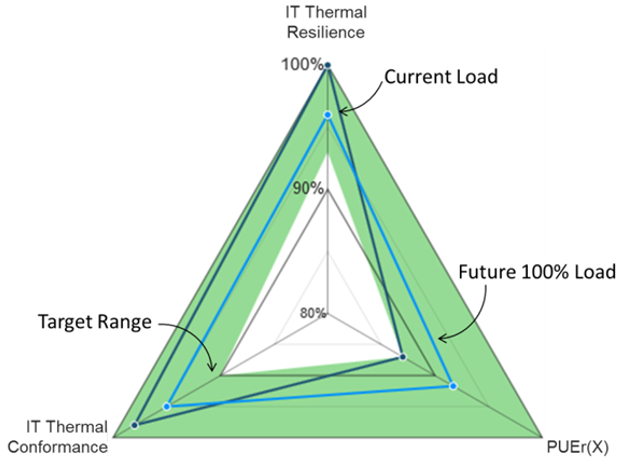
Example visualization of Performance Indicator for a data center (Courtesy of The Green Grid)
PUEr is a way to express how far your data center is from your target PUE. The Green Grid defines seven PUE ranges, from A to G, each representing a different level of efficiency. A, the most efficient range, is 1.15 to 1.00, while G, the least efficient one, ranges from 4.20 to 3.20.
Every data center falls into one of the seven categories, and your PUEr shows how far you currently are from the lower end of your target range (remember, lower PUE means higher efficiency).
So, if your facility’s current PUE is 1.5, which places you into category C (1.63 – 1.35), and your target is to be at the top of C, you would divide 1.35 by 1.5 and get a PUEr of 90% as a result. You do have to specify the category you’re in, however, so the correct way to express it would be PUEr(C)=90%.
IT Thermal Conformance is simply the proportion of IT equipment that is operating inside ASHRAE’s recommended inlet-air temperature ranges. In other words, it shows you how well your cooling system is doing what it’s designed to do. To find it, divide the amount of equipment that’s within the ranges by the total amount of equipment, Seymour explains.
The Green Grid chose to use ASHRAE’s recommendations, but data center operators may choose to determine themselves what temperature ranges are acceptable to them or use manufacturer-specified thermal limits without degrading the metric’s usefulness, he adds.
IT Thermal Resilience shows how much IT equipment is receiving cool air within ASHRAE’s allowable or recommended temperature ranges when redundant cooling units are not operating, either because of a malfunction or because of scheduled maintenance. In other words, if instead of 2N or N+1, you’re left only with N, how likely are you to suffer an outage?
This is calculated the same way IT Thermal Conformance is calculated, only the calculation is done while the redundant cooling units are off-line. Of course, The Green Grid would never tell you to intentionally turn off redundant cooling units. Instead, they recommend that this measurement be taken either when the units are down for maintenance, or, better yet, that you use modeling software to simulate the conditions.
Modeling Makes PI Much More Useful
Modeling software with simulation capabilities used in combination with PI can be a powerful tool for making decisions about changes in your data center. You can see how adding more servers will affect efficiency, resiliency, and cooling capacity in your facility, for example.
This is where it’s important to note that Future Facilities is a vendor of modeling software for data centers. But Seymour says that about 50 members of The Green Grid from many different companies, including Teradata, IBM, Schneider Electric, and Siemens, participated in the metric’s development, implying that the process wasn’t influenced by a single vendor’s commercial interest.
Four Levels of Performance Indicator
The Green Grid describes four levels of PI assessment, ranging from least to most precise. Not every data center is instrumented with temperature sensors at every server, and Level 1 is an entry-level assessment, based on rack-level temperature measurements. ASHRAE recommends taking temperature readings at three points per rack, which would work well for a Level 1 PI assessment, Seymour explains.
Level 2 is also based on measurements, but it requires measurements at every server. To get this level of assessment, a data center has to be instrumented with server-level sensors and DCIM software or some other kind of monitoring system.
If you want to get into predictive modeling, welcome to PI Level 3. This is where you make a PI assessment based on rack-level temperature readings, but you use them to create a model, which enables you to simulate future states and get an idea of how the system may behave if you make various changes. “That gives the opportunity to start making better future plans,” Seymour says.
This is where you can also find out whether your data center can handle the load it’s designed for. Say you’re running at 50% of the data center’s design load, which happens to be 2MW. If you create a model, simulate a full-load scenario, and find that either your IT Thermal Conformance or your IT Thermal Resilience is only what you want it to be at 1.8MW, you’ve wasted your money.
Those are just a couple of possible use cases. There are many more, especially with PI Level 4, which is similar to Level 3 but with a much more precise model. This model is calibrated using temperature readings from as many points on the data center floor as possible: servers, perforated tiles, return-air intake on cooling units, etc. This is about making sure the model truly represents the state of the data center.
Different operators will choose to start at different levels of PI assessment, Seymour says. Which level they choose will depend on their current facility and their business needs. The point of having all four levels to avoid preventing anyone from using the new metric because their facility doesn’t have enough instrumentation or because they haven’t been using monitoring or modeling software.


