Winston Saunders has worked at Intel for nearly two decades and currently leads server and data center efficiency initiatives. Winston is a graduate of UC Berkeley and the University of Washington. You can find him online at “Winston on Energy” on Twitter.
 WINSTON SAUNDERS
Intel
This is the third post in a series on Exascalar. See Part II.
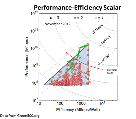
The Exascalar plot of the recent Green500 data shows a triangular shape (as shown in Part I) reproduced below with a triangle added for emphasis. The shape is so persistent I decided to spend a little time thinking about what the shape means and thought I’d share some insights. Of course, this being social media, comments and corrections are always welcome.
Examining the Elements
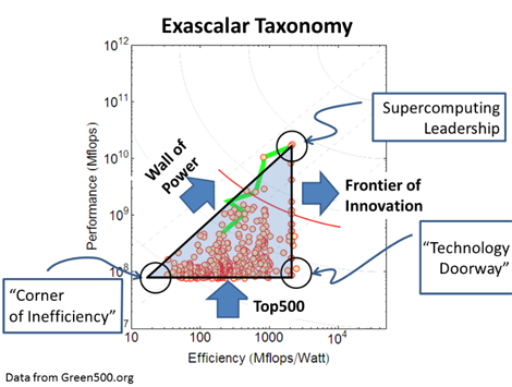
To describe something, it’s best to give it a name. So I decided to give each element of the triangle a name. The upper vertex of the triangle, for instance, has the highest performance and very high (perhaps even the highest) efficiency. This corner represents “Super Computing Leadership.” The vertex at the lower right, we have seen previously, is where new architectures with higher efficiency tend to appear. This was the case with the BlueGene Architecture in June 2011, as is the case with the Xeon Phi architecture in November 2012. This corner is appropriately named the “Technology Doorway.”
The corner to the left I call the “Corner of Inefficiency.” Why? As I noted in my previous blog post my previous blog post, the systems here produce no more work output that systems in the “Technology Doorway” but at this time may consume up to one hundred times more energy, representing a huge opportunity for cost-of-ownership optimization.
Each leg of the triangle can also be associated with a specific attribute. The base of the triangle is the lower performance cut-off of the Top500 list and is governed by performance and the population of supercomputers. The hypotenuse is constrained by system power. The associated economics push against a “Wall of Power.” We expect this edge of the triangle to be largely immobile. The right leg of the triangle is by far the most interesting as systems along this edge represent are pushing forefront of technology and efficiency innovation. This leg will push to the right as time advances.
An encouraging evolution would be to see the triangle, which indicates systems are primarily retired for performance reasons, turn into more of a trapezoidal shape, where there is an equally pronounced cut-off at the “corner of inefficiency.” Given large energy budgets required for multi-MegaWatt systems. This seems like an opportunity.
Future releases of Exascalar will either validate this viewpoint or provide greater insight into the development of computing technology. Until that time, as always, comments are encouraged and appreciated.
Industry Perspectives is a content channel at Data Center Knowledge highlighting thought leadership in the data center arena. See our guidelines and submission process for information on participating. View previously published Industry Perspectives in our Knowledge Library.


